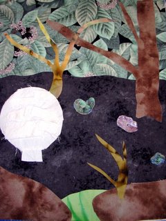
I woke up this morning with a quilt design dancing in my head, and I've been working on the quilt. I keep not being satisfied. I do some rearranging, then do another project so my brain gets a chance to think, and then go back to the quilt. I think I'm closing in on what needs to be done, but I'm open to suggestions.
4 comments:
Since your toad stool is the subject matter, I'd try to have a little less background going on and more focus on the stool. I love the leaf print, BTW. Maybe try to make the stool a little less perfectly round. I know that's how it looks in nature (and I, for one, am usually very literal in my translations to fabric), but I've been learning through drawing and other art classes that sometimes its best to use a little artistic license. You could also try adding some shadows to the edges of the textured flaps to give it more depth. Good luck, keep going, I can't wait to see more!
I agree the toadstool is too white/bright, it needs to be reshaped slightly and toned down with coffee and texture, maybe consider making it out of multiple layers of a cotton lace? It needs to go over a tad to the right and down a tad for more balance, it seems off balance to me the way it is, or should i say it makes me feel slightly off balance to look at it the way it is. I love the background though.
Deb, what a great inspiration photo, and you've made a great start on the composition. My first impression is that the mushroom is too white, but that can easily be fixed with a little subtle painting, which can also be used to shade and emphasize the roughness of the texture. I'd also move the toadstool a bit down and to the right, as dejablu has suggested. I love the background you've already started, and can't wait to see what quilting will do for it.
Deb--
As many others have commented, the toadstool is not placed well. My inclination, as others', is to have it more to the right. However, you might experiment with it being farther to the left as well. Part of the problem with the placement is that the round edge is just barely touching the frame. In the photography classes I've taken, the instructor would have us reframe a similar photo with either a larger gap between frame and object or cutting off some of the object so that it is anchored by the frame. Hope this helps.
Post a Comment